View Analytics

You can view scatterplot charts correlating your students' performance with engagement, time spent in the course, or activities opened. These can both indicate overall class performance and help you identify students whose performance is significantly above or below the average or not correlated with other factors.

  1. In the toolbar, click Progress.
  2. Click the Analytics tab.
  3. Click the chart you want to view.
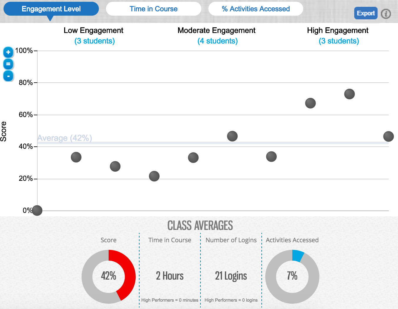
    Engagement Level
    Shows correspondences between your students' engagement levels and overall scores.

    Engagement is calculated based on a combination of factors including time in course, activities opened, highlights made in the textbook, and searches.

    Time in Course
    Shows correspondences between the amount of time your students have spent in the course and their overall scores.
    % Activities Accessed
    Shows correspondences between the percentage of activities your students have opened and their overall scores.
    engagement level scatterplot showing 10 students' engagement levels on the horizontal axis and scores on the vertical axis
  4. Move your pointer over a dot on the chart to view summary information for the student. Click the summary information to view detailed performance.

Students who have not logged in to MindTap are not shown in analytics graphs.

Note Analytics reports include data from Google Analytics and other tools. Some browser extensions used for privacy or ad blocking (Ad-block, Disconnect, Privacy Badger, Ghostery, and others) can prevent collecting data used for engagement or other analytics reporting. Reported engagement or time spent data for students using these browser extensions might be lower than the actual values.

Cengage is committed to protecting personal information. See the Privacy Policy.